
Understanding Crimson Art Shades in Painting
- Epistle Communications
- Jun 1
- 3 min read
The use of crimson in art is a study in precision. It is a color that demands attention. It is neither too bright nor too dull. It holds a middle ground that artists find useful. I will explain the basics of crimson art shades. I will also cover how to use them effectively. This will help anyone interested in art classes in Texas or those wanting to improve their painting skills.
Exploring Crimson Art Shades
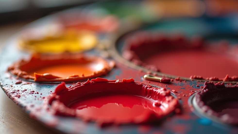
Crimson is a deep red color. It has a slight blue undertone. This makes it cooler than pure red. It is often used to create depth in paintings. It can represent strong emotions or natural elements like blood or autumn leaves.
Artists use crimson in different ways. Some mix it with white to get lighter shades. Others add black for darker tones. The choice depends on the mood or effect they want.
In art classes, learning to mix crimson shades is important. It teaches control over color intensity. It also helps in understanding color relationships. For example, crimson pairs well with greens and blues. These combinations create contrast and balance.
Practical uses of crimson art shades
Adding shadows in portraits
Painting flowers like roses or poppies
Creating dramatic skies in landscapes
Highlighting details in still life paintings
These uses show the versatility of crimson. It is not just a color but a tool for expression.

What color palette is crimson?
Crimson belongs to the red color family. It is part of a warm color palette. However, its blue undertone gives it a cooler edge. This makes it unique among reds.
The crimson palette includes various shades. These range from bright crimson to deep maroon. Each shade has a specific use in art.
Bright crimson: Used for highlights and vibrant areas
Deep crimson: Used for shadows and depth
Muted crimson: Used for background or subtle effects
Understanding these shades helps in creating balanced artwork. It also aids in mixing colors correctly.
The crimson palette is often combined with earth tones. Browns, ochres, and siennas work well with crimson. This combination is common in traditional and classical art.
Techniques for using crimson in painting
Using crimson requires skill. It can overpower other colors if not handled well. Here are some techniques to use crimson effectively:
Layering: Apply thin layers of crimson to build depth gradually.
Blending: Mix crimson with other colors on the palette for smooth transitions.
Glazing: Use transparent layers of crimson to add richness without heaviness.
Dry brushing: Apply crimson lightly to create texture and highlights.
These techniques are taught in art classes. Practicing them improves control over the color. It also enhances the overall quality of the painting.
Mixing crimson with other colors
Mixing crimson is a key skill. It allows artists to create custom shades. Here are some common mixes:
Crimson + white = pink shades
Crimson + black = burgundy or maroon
Crimson + yellow = orange-red tones
Crimson + blue = purple-red hues
Each mix changes the mood of the painting. For example, pink shades are softer and more delicate. Burgundy adds richness and sophistication.
Experimenting with mixes is encouraged in art education. It helps students understand color theory. It also boosts creativity.
Building skills with crimson art shades
To master crimson, practice is essential. Here are some tips:
Start with simple exercises using crimson and white.
Paint objects that naturally have crimson tones like apples or flowers.
Observe how light affects crimson in real life.
Join local art classes to get feedback and guidance.
Participate in exhibitions to showcase your work.
These steps help build confidence. They also connect you with a community of artists. This is important for growth and motivation.
Using the crimson palette can be a gateway to exploring more colors. It offers resources and workshops for all skill levels. This makes it easier to learn and improve.
Encouraging artistic growth with crimson
Crimson is more than a color. It is a foundation for learning art. It teaches control, mixing, and expression. For those in Texas, it is a practical starting point. It fits well with many subjects and styles.
By focusing on crimson art shades, you can develop a strong color sense. This will help in all types of painting. Whether you prefer landscapes, portraits, or abstract art, crimson has a place.
Keep practicing. Use the techniques and tips shared here. Explore the crimson palette for more learning opportunities. This will help you discover your artistic talents and prepare you for local exhibitions.
Art is a skill. It grows with effort and guidance. Crimson is a useful tool on this journey. Use it well.


Comments